How Global Travel & Japanese Design Philosophy Shaped a Unique Family Home

Photographer
Stephanie Russo
Category

Project Tours

The full story

Designing a home for a growing family often starts with practical needs—but the most successful spaces are shaped by something deeper: how people live, what they value, and the places that have left a lasting impression on them.

For this project, the challenge wasn’t just updating a house—it was finding harmony between two very different design sensibilities. One half of the household was drawn to bold color, eclectic pieces, and objects collected through years of global travel. The other craved calm, simplicity, and a home that felt grounding after long days at work. With a new baby on the way, the space also needed to be functional, flexible, and restorative.

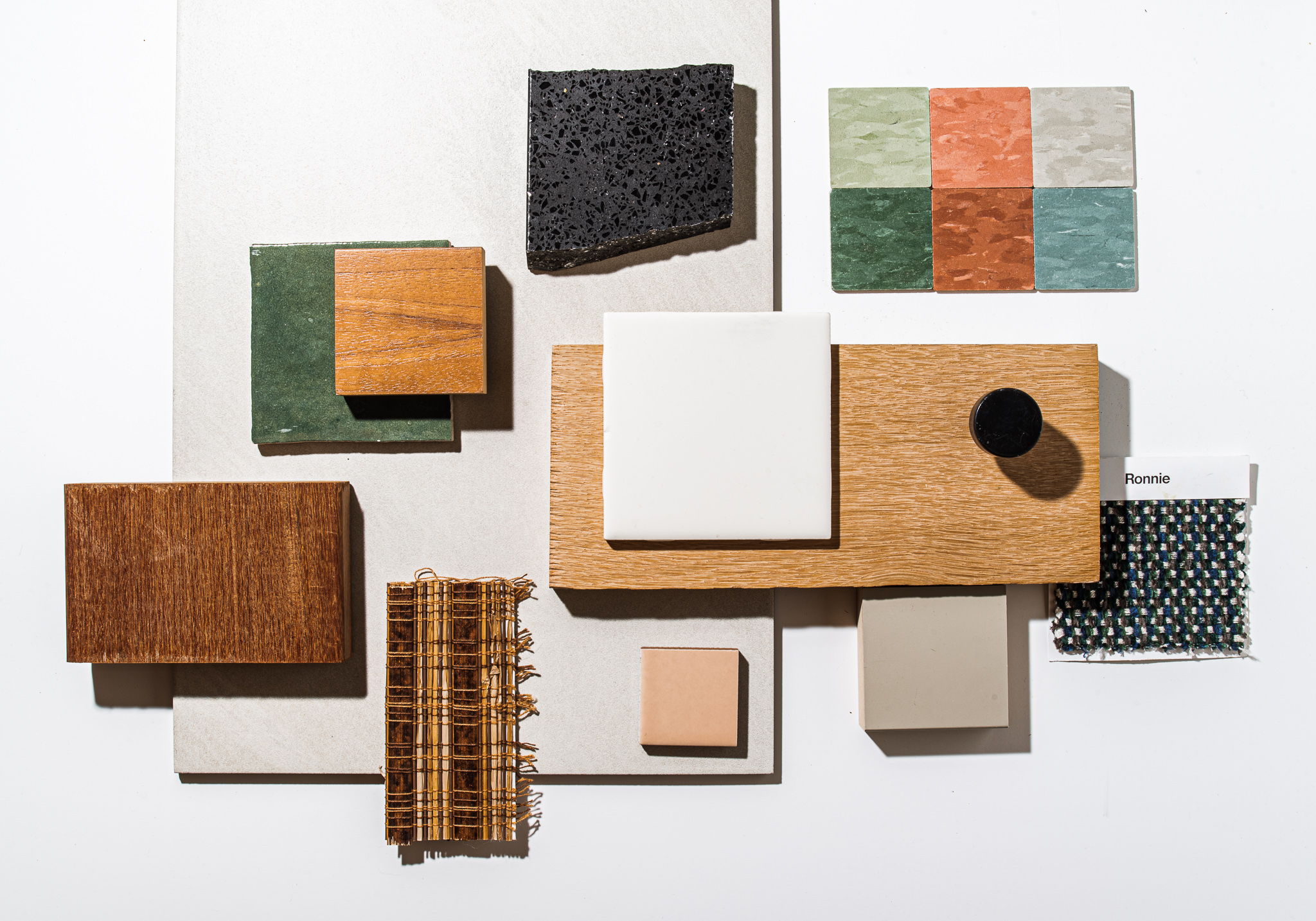
The result was a concept we called Pan Zen—a design approach that blends global influence with Japanese design philosophy, balancing expressive personality with intentional restraint.

At the core of this home is a quiet tension that many families experience: how do you create a space that feels expressive without becoming chaotic, and serene without feeling sterile?

Japanese design principles provided a strong foundation. Ideas like balance, negative space, natural materials, and thoughtful restraint helped guide the architecture of each room. Clean lines, warm woods, and simple forms created a sense of calm and clarity throughout the home.

Layered on top of that structure came the “Pan” side of the concept—globally inspired color, texture, and personal artifacts collected over time. Rather than competing with the Zen foundation, these elements were curated carefully, allowing each piece to feel intentional rather than overwhelming.

The goal wasn’t minimalism for its own sake. It was balance.

Designing for a Real Family with Practical Needs and Realistic Budgets

A key priority throughout the project was designing a home that worked for everyday life. With a baby on the way, spaces needed to feel comfortable, durable, and adaptable—not precious or overly styled.

This meant thinking carefully about layout, circulation, and how rooms would be used throughout the day. Open areas were designed to encourage connection and conversation, while quieter corners offered moments of retreat. Storage was integrated thoughtfully to reduce visual clutter, supporting the calm, grounded feeling the homeowners were seeking.

Rather than chasing trends, each decision was evaluated through a practical lens: Does this support how the family lives? Will it still feel good five years from now?

Key Transformations Throughout the Home

A calming, hotel-inspired ensuite. Inspired by Japanese hotels experienced during the homeowners’ travels, the primary ensuite was reimagined as a peaceful retreat. Natural light, warm wood tones, and carefully selected tile create a space that feels both restorative and refined. Every material was chosen to support a sense of calm, making the room feel like a pause from the rest of the day.

A living room built around balance. The living room became the heart of the home—grounded by natural materials and softened with layered textiles and globally sourced accents. Furniture placement was intentional, encouraging conversation while maintaining a sense of openness. The space feels collected rather than decorated, reflecting both personalities without leaning too far in either direction.

A small kitchen with thoughtful impact. Rather than a full overhaul, the kitchen was refreshed with strategic updates that delivered maximum impact on a controlled budget. Open shelving, subtle hardware changes, and refined finishes brought warmth and personality without sacrificing function. It’s a reminder that meaningful transformation doesn’t always require starting from scratch.

A soft, welcoming nursery. The nursery was designed to feel gentle, warm, and adaptable as the child grows. Soft color choices, simple forms, and natural textures create a space that feels comforting without being overly themed—allowing the room to evolve over time.

Lessons From Pan Zen: Designing with Intention

This project is a reminder that great design doesn’t come from choosing a single style and sticking to it rigidly. It comes from understanding how different influences can work together when anchored by a clear philosophy.

A few takeaways for homeowners designing their own spaces:

  • Start with how you want your home to feel, not how you want it to look
  • Use restraint as a design tool, not a limitation
  • Let personal objects and travel memories tell your story—but edit thoughtfully
  • Balance expressive elements with calming foundations
  • Design for real life, not just photos

When structure and emotion are aligned, a home becomes more than a collection of rooms—it becomes a place that supports daily life while reflecting the people who live there.

Getting to the Right Outcome

Projects like Pan Zen take shape through a process of listening, testing, and refining—rather than starting with a fixed vision or a prescribed style. From the outset, the focus was on understanding how the family actually lives, what they need from their space day to day, and where design could help solve practical challenges without adding unnecessary complexity.

As ideas were explored and refined, the design evolved in response to real constraints—space, function, and differing preferences—allowing each decision to build naturally on the last. That approach made it possible to balance calm and personality, restraint and expression, without forcing the home into a single aesthetic category.

The finished home isn’t the result of a single “right” answer, but of a thoughtful process shaped over time—one that feels personal, balanced, and genuinely suited to the family who lives there.

Here's a breakdown of the spaces we transformed:
No items found.

The Ensuite Expansion

  • We wanted to create a hotel-like suite in this new space, featuring an open concept with the bathroom and bedroom connected to one another. We modeled the room off of a Kyoto hotel room, drawing inspiration from one of their past travel journeys together. 
  • Once the new structure for our ensuite was built (starting with footings, then framing, electrical, plumbing, sheetrock, etc) we painted it all white as our base layer then started layerings in lots of neutral zen-like tones. 
  • We built in a huge custom wardrobe to serve as their closet, which started with an old Drexel dresser that we completely overhauled. And with the help of our woodworker, Thomas, we created additional shoe storage and two big closets that flanked the dresser to give them loads of hanging room. 
  • We infused as much light as we could through lots of new windows, including two large (one almost 6 feet long!) clerestory windows we put into the bathroom, and a single panel French door leading to their backyard.
  • For their new bathroom, we found a vintage MCM dresser and repurposed it into a double sink bathroom vanity. We added green zelige tile up the entire bathroom wall behind the vanity for a pop of color, and then layered it with an up-cycled mirror that we had Thomas, our woodworker, frame with wood to tie it into the vanity. We created a large walk in shower, loaded it with up with interior plants thanks to Propagate (to feel instantly connected to nature) and added two custom-built Shoji room dividers that we handmade in our workshop.
No items found.

Living Room Refresh

  • We re-oriented the room so that their fireplace became the focal point of this room. Then we gave the fireplace a facelift by wrapping the weathered bookshelves in white oak veneer and painting all the fireplace bricks a calming khaki color. Finally, we balanced all of the neutrals with colorful, globally inspired finds on all the shelves.
  • We ground the room in wood furnishings with clean lines, but then layered in whole lotta colorful funk and globally sourced goods through things like patterned armchairs, a gorgeous color blocked tapestry from Oaxaca, Mexico, and a vintage Japanese lantern light that we restored by simply adding new Japanese ginwashi paper. 
  • We also opened up the entryway for them by taking down a completely nonfunctional half-wall that sat about 2 feet from the front door to make more room for a bigger dining room table and chairs. 
  • Finally, we created a custom art print for their wall, inspired by some original so-funky-but-so-fab linoleum that we found under FOUR layers of other faded linoleum we peeled back during demo'ing the kitchen. Kele designed a print that would give homage to the homes’ original bones, all while bringing some more color into the space.

No items found.

Kitchen

  • The Lims were on a pretty tight budget and needed to apply the majority of their money to the ensuite expansion, so we focused on cosmetic upgrades in the kitchen. 
  • We extended the hardwood flooring found in the rest of the house into the kitchen to keep the materials less busy and more streamlined for Chris. Originally (as featured in the mood board above) we tried to convince him of installing a colorful marmoleum flooring in a fun pattern (to save on costs, since hard wood flooring ain't cheap), but it ended up being a material that reminded Chris too much of being at work. Ha! Marmoleum has come a long way, and is a big fat YES in our books, but we totally get that it's a specific thing that's not for everyone! 
  • We couldn't redo all the cabinetry due to the budget, so we took off all of the original cabinet fronts and Thomas, our woodworker, rebuilt custom white oak fronts for us. We also ripped out all of the upper cabinets and put in white oak open shelving, which sat in front of a simple white square Dal tile backsplash that we added. We installed new matte black hardware, a new black sink and faucet and sourced a fun vintage Japanese-inspired light fixture to hang over the sink. 
  • With the one empty wall in their kitchen, we built a custom hanging shelving system out of walnut, which gave them storage space and also doubled as a sitting nook and coffee bar. We really tried to maximize every square inch of this wall, knowing that in small kitchens every ounce of usable space needs to be efficiently put to good use!

No items found.

Nursery Room

  • When we started this project, we were planning to turn Megan and Chris’ old bedroom into a flex space, but once they found out they were having a second little girl (about half way through our remodel with them), we went to work turning it into a nursery room. 
  • As the mom of three boys who lives in a world full of reptiles and neon dri fit, I jumped at the chance to lean into my I-wish-I-had-a-girl-too dreams in this room.  And I fully conferred with Megan before doing this….but yes even though it could be considered cliché, I painted the room pink. But barely!! A light blush, a calming pink, something that said, I can be feminine and strong and also freakin’ like pink. 
  • We worked with one of my favorite children's shops in town, Bitte, to fill the room with the most beautiful linens, toys and stuffed animals. All things to properly welcome their new baby girl. And of course, the moment older sister, Juniper, saw the room during our reveal day she claimed it as her own! (Damn right she did, oldest children - me being one - always have to lay our claim on the world).